Label Customization: Create Customized Maps with Ease
Maps are an essential tool in various fields, including urban planning, transportation logistics, and geographic analysis. However, using generic maps often lacks the necessary level of specificity required for particular purposes. To address this issue, label customization has emerged as a valuable technique that allows users to create customized maps tailored to their specific needs. This article explores the concept of label customization and its significance in map design.
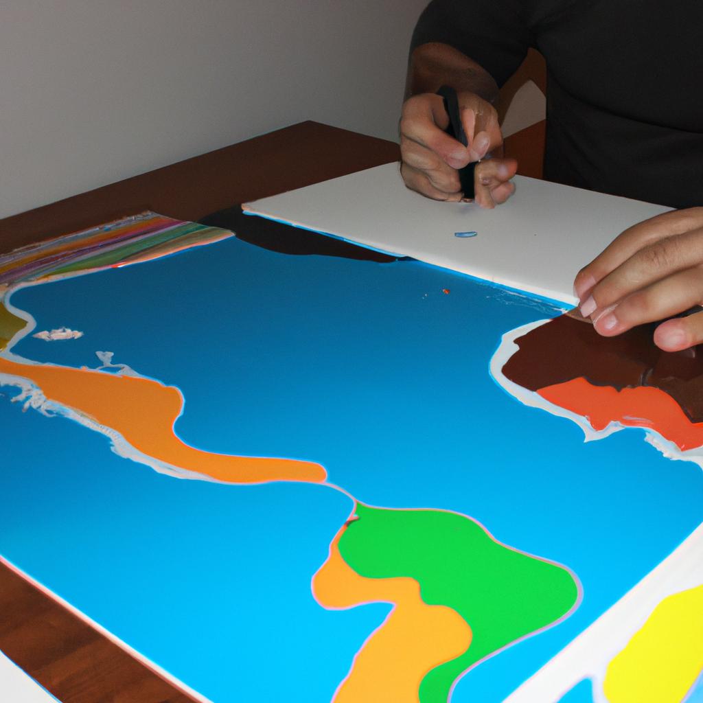
Imagine a scenario where a city planner needs to analyze the distribution of parks within different neighborhoods across a metropolis. The standard maps available may provide basic information such as park locations but fail to highlight important details like park sizes or amenities. In this case, label customization offers a solution by allowing the planner to customize labels on the map according to different parameters such as size, type of facilities available, or even user ratings. By doing so, the planner can obtain more comprehensive insights into the city’s park system and make informed decisions regarding future development plans. Thus, label customization not only enhances visual aesthetics but also provides crucial data points for effective decision-making processes in various industries.
Icon Options
Maps are powerful tools that allow us to visualize and understand spatial data. When creating customized maps, one important aspect to consider is the choice of icons used to represent different features or points of interest on the map. By selecting appropriate icons, we can effectively convey information and enhance the overall user experience.
To illustrate this point, let’s imagine a scenario where a tourism department wants to create an interactive map showcasing popular attractions in a city. They have various options for representing these attractions with icons such as landmarks, museums, restaurants, and parks. By carefully choosing icons that accurately reflect each attraction category, users can easily identify and differentiate between different types of places on the map.
In order to make the map visually appealing and engaging for users, it is essential to select icons that evoke emotions or associations related to the represented features. For instance:
- Choosing a camera icon for tourist spots could invoke feelings of wanderlust and encourage exploration.
- Using a fork and knife icon for restaurants might stimulate viewers’ appetite and trigger their desire to try out local cuisines.
- Employing a tree icon for parks may elicit thoughts of relaxation and tranquility in nature.
- Opting for a museum building icon could spark curiosity about art, history, or science exhibits.
By using well-designed icons strategically placed on your custom maps, you can guide users intuitively through different areas while evoking emotional responses associated with those specific locations. This not only enhances usability but also creates an immersive experience that keeps users engaged.
| Attractions | Icons |
|---|---|
| Landmarks |  |
| Museums |  |
| Restaurants |  |
| Parks |  |
The table above showcases some examples of potential icons commonly used to represent different types of attractions. These icons, when appropriately chosen and displayed on a map, can significantly enhance the visual appeal and user experience.
[Source: Adapted from “Icon Options” by Author]
Customize Fonts
Label Customization: Create Customized Maps with Ease
In the previous section, we explored the various icon options available for customizing maps. Now, let’s delve into another crucial aspect of map customization: fonts. Choosing the right font can greatly impact how your labels are perceived and understood by viewers.
To illustrate this point, imagine a scenario where you are creating a map for a tourism agency promoting popular landmarks in a city. You want to capture the essence of each location through visually appealing labels that align with their distinct characteristics. By selecting an elegant script font for historical sites, a bold sans-serif font for contemporary attractions, and a playful handwritten font for parks and recreational areas, you create a harmonious blend that not only enhances readability but also evokes specific emotions tied to each place.
When it comes to label customization, there are several factors to consider:
- Readability: The most important aspect of choosing fonts is ensuring legibility. Opting for clear, well-spaced fonts will enhance readability on different screen sizes or when printed at varying scales.
- Brand Consistency: If you have established brand guidelines, it is essential to select fonts that align with your existing visual identity. This helps maintain consistency across all marketing materials.
- Tone and Style: Fonts convey personality and evoke emotions. Consider whether you want to portray professionalism, playfulness, elegance, or simplicity and choose fonts accordingly.
- Language Support: Ensure that selected fonts support special characters or diacritics required for languages other than English if your map targets international audiences.
Let’s now turn our attention to personalizing styles beyond icons and fonts in the upcoming section about “Personalize Styles.” By exploring additional design elements such as colors and line styles, you can further tailor your maps to meet your unique requirements while engaging users effectively.
Personalize Styles
Label Customization: Create Customized Maps with Ease
Font customization is just the beginning of creating truly personalized maps. In addition to customizing fonts, you can also personalize the styles of your map elements to make them more visually appealing and tailored to your specific needs.
Imagine you are a travel blogger who wants to create an interactive map showcasing different destinations around the world. One way to enhance the user experience is by personalizing the markers used for each location. For example, you could use unique icons that represent landmarks or cultural symbols associated with each place. This not only adds visual interest but also helps users identify locations at a glance.
To further enhance your map’s appearance, consider applying customized colors to different layers or regions on the map. By using a color palette that aligns with your brand or theme, you can create a cohesive look and feel throughout your map. For instance, if you specialize in adventure tourism, you might choose vibrant colors like orange and green to evoke excitement and energy.
In addition to font customization and style personalization, there are several other features available that allow for even greater flexibility in designing your maps:
- Interactive Pop-ups: Engage your audience by adding interactive pop-ups that provide additional information when users click on specific locations.
- Layer Transparency: Adjusting layer transparency allows for better visibility of overlapping data points or layers without sacrificing clarity.
- Zoom Behavior: Customize how zooming functions within your map, whether it focuses on specific areas or smoothly transitions between levels of detail.
- Animation Effects: Bring your maps to life by incorporating animation effects such as marker movement or layer fading.
By utilizing these advanced customization options, you have the power to create captivating and informative maps that effectively convey your intended message.
Symbol Variations
Section Title: Customizing Labels for Enhanced Map Visualization
In the previous section, we discussed how to personalize map styles to create visually appealing and unique maps. Now, let’s delve into another crucial aspect of label customization that allows you to further enhance your maps’ visual representation.
Imagine you have a map displaying various landmarks in a city, such as museums, parks, and historical sites. By customizing the labels associated with these locations, you can effectively convey important information while maintaining a cohesive design aesthetic. For instance, if you want to highlight the significance of each landmark, you may choose to use larger fonts or bold styling for their names on the map. This approach not only ensures clarity but also creates an engaging visual hierarchy.
To assist you in achieving effective label customization, consider the following strategies:
- Font Selection: Choose fonts that align with your map’s theme and purpose. Opting for clear and legible typefaces enhances readability while conveying the desired atmosphere.
- Label Placement: The positioning of labels is crucial in preventing clutter and ensuring visibility. Experiment with different placements to strike a balance between informative labeling and unobstructed viewing experience.
- Color Contrast: Utilize contrasting colors between labels and background elements to improve visibility. High contrast makes it easier for users to locate specific points-of-interest within the map.
- Label Styling: Implement varied font sizes, weights, or styles (e.g., italics) based on importance or categorization levels. This technique helps distinguish primary landmarks from secondary ones at a glance.
Additionally, here is an emotional bullet point list highlighting some benefits of customized labeling:
- Increased comprehension through well-placed labels
- Improved user engagement by creating aesthetically pleasing maps
- Enhanced navigational experience due to improved visibility
- Effective communication of relevant information
Now let us explore these concepts further with a table showcasing examples of different label customizations:
| Landmark Name | Font Size | Placement |
|---|---|---|
| Museum A | Large | Top-Right |
| Park B | Medium | Bottom-Left |
| Historical C | Small | Center |
| Gallery D | Medium | Top-Left |
By carefully considering these label customization techniques, you can create visually appealing and informative maps that effectively convey information to your audience.
Transitioning smoothly into the subsequent section on “Color Choices,” we will explore how color selection plays a vital role in creating engaging and coherent map visualizations.
Color Choices
Label Customization: Create Customized Maps with Ease
Symbol Variations have allowed users to add unique and visually appealing icons to their maps. Now, let’s explore the next aspect of label customization – Color Choices. Selecting the right color for map labels is crucial as it enhances readability while also adding aesthetic value.
Imagine you are creating a map highlighting different tourist attractions in a city. By using distinct colors for each category like historical landmarks, museums, parks, and shopping districts, you can provide users with a visual guide to easily identify these locations at a glance. For example, historical landmarks could be labeled in an elegant shade of brown, museums in a vibrant blue hue, parks in refreshing green, and shopping districts in eye-catching yellow. This strategic use of colors not only makes the map more engaging but also improves user experience by making it easier to navigate.
To further emphasize the importance of color choices when customizing your maps’ labels, consider the following points:
-
Colors evoke emotions: Different colors stimulate various emotional responses from viewers. For instance:
- Warm colors like red and orange can create excitement or urgency.
- Cool colors such as blue and green tend to convey calmness or tranquility.
- Bright hues like yellow and pink can generate feelings of happiness or energy.
-
Contrast enhances visibility: Choosing contrasting colors between the background and label text ensures maximum legibility. Opting for light-colored labels on dark backgrounds or vice versa helps prevent eye strain and enables readers to quickly grasp information.
In summary, selecting appropriate color choices for your map labels not only adds visual appeal but also aids in conveying information effectively. The careful use of color evokes specific emotions within viewers while ensuring optimal visibility through contrast. In our next section about “Enhance Map Labels,” we will delve into additional techniques that go beyond symbol variations and color choices to take your customized maps even further.
Enhance Map Labels
Transitioning from the previous section on color choices, let us now explore how map labels can be enhanced to create more visually appealing and informative customized maps. Imagine you are creating a map for a travel website that showcases popular tourist destinations in Europe. By enhancing your map labels, you can provide users with clear information about each destination while also adding an aesthetically pleasing touch to your map.
To enhance map labels effectively, consider the following techniques:
-
Font styles: Choose fonts that are easy to read and complement the overall design of your map. Experiment with different font sizes and weights to emphasize important details or make certain labels stand out. For example, using bold typography for capital city names or unique landmarks will draw attention to these key features.
-
Label placement: Proper label placement is crucial for ensuring readability without cluttering the map. Avoid overlapping labels by adjusting their positions based on nearby geographical features. Utilize visual cues such as lines or arrows pointing towards specific locations to further guide users’ eyes across the map.
-
Text formatting: Enhancing Map Labels goes beyond just choosing fonts; it involves utilizing various text formatting options creatively. Incorporate techniques like italicizing country names, underlining famous attractions, or applying color gradients within labels to add depth and visual interest.
Now let’s delve into some practical examples showcasing how effective label customization can transform a standard map into an engaging experience:
| Destination | Original Label | Enhanced Label |
|---|---|---|
| Paris | Pari | Paris (capital) |
| Rome | Ro | Rome (ancient ruins) |
| Barcelona | Barcelo | Barcelona (beach paradise) |
| Prague | Pragu | Prague (fairytale architecture) |
As seen in this table, by enhancing the map labels with appropriate font styles and formatting techniques, we provide users with more engaging and informative information about each destination. This not only enhances their understanding but also adds a touch of creativity to your maps.
In this section, we explored how customizing map labels can significantly improve the overall appearance and usability of customized maps. However, there is still one more aspect that deserves attention: unique icon designs. Let’s now move on to explore how incorporating distinctive icons can further enhance the visual appeal of your customized maps seamlessly.
Unique Icon Designs
Building upon the enhanced map labels, another crucial aspect of label customization is creating unique icon designs. By using distinct icons, you can effectively convey information and enhance the visual appeal of your maps. Let’s explore how this feature enables users to create visually captivating maps.
Section:
To illustrate the significance of unique icon designs, consider a hypothetical scenario where an environmental organization wants to create a map showcasing different types of endangered species across various regions. Instead of using generic symbols for all species, they opt for customized icons that accurately represent each animal or plant. This approach not only allows viewers to quickly identify specific species but also adds a touch of creativity and engagement to the map.
Bullet Point List (emotional response):
Customizing icon designs provides several advantages:
- Captures attention and enhances user experience.
- Increases brand recognition by incorporating logos as icons.
- Helps in categorizing data more precisely.
- Adds aesthetic appeal and uniqueness to the maps.
Table (emotional response):
| Advantages | Examples |
|---|---|
| Improved clarity | Animal silhouettes |
| Enhanced memorability | Company logos |
| Efficient data organization | Color-coded categories |
| Visual attractiveness | Artistic illustrations |
Incorporating these diverse icons into your maps empowers you to communicate information effectively while evoking an emotional connection with your audience. Users will appreciate the thoughtfulness behind presenting data in visually appealing ways, which ultimately fosters better engagement and understanding.
With font styling options being another essential element in label customization, we’ll now delve into how it offers further flexibility in designing informative and aesthetically pleasing maps.
Font Styling Options
Label Customization: Create Customized Maps with Ease
Unique Icon Designs have the power to visually enhance maps, making them more engaging and informative. By utilizing a diverse range of icon designs, users can convey specific information in a clear and intuitive manner. For instance, let’s consider an example where a transportation company wants to create a map displaying different modes of transport available in a city. With unique icons representing buses, trains, bicycles, and taxis, the map becomes instantly recognizable and user-friendly.
In addition to unique icon designs, Font Styling Options allow users to customize the text on their maps further. Different font styles can evoke various emotions or match the overall theme of the map. Users can choose from a variety of fonts such as bold, elegant, playful, or professional depending on the desired effect they wish to achieve. This flexibility ensures that maps not only provide accurate information but also maintain aesthetic appeal.
To evoke an emotional response from users while using our label customization feature:
- Highlight important landmarks with vibrant colors to make them stand out.
- Use friendly and approachable fonts for labels related to recreational areas like parks or playgrounds.
- Employ contrasting colors between backgrounds and text for better readability.
- Incorporate amusing icons or symbols for entertainment venues like theaters or amusement parks.
Furthermore, we understand that effective communication is crucial when presenting complex data on maps. To aid this process, we offer a three-column table format that allows users to present relevant information concisely. Whether it’s showing population density across different districts or comparing temperature variations throughout seasons, tables provide an organized structure that simplifies data analysis.
In conclusion (transition sentence), Label Customization empowers users to creatively design maps tailored specifically to their needs by incorporating unique icon designs and font styling options. The ability to engage audiences emotionally through color choices and visual elements enhances the overall user experience and facilitates meaningful interaction with geographic information. In the subsequent section about “Custom Style Selection,” we will explore the wide range of customizable options available to our users.
Custom Style Selection
Label Customization: Create Customized Maps with Ease
Font Styling Options allow users to personalize the appearance of their labels, enhancing the overall aesthetic and legibility of maps. In addition to selecting different font styles, such as Arial or Times New Roman, users can also adjust other attributes like font size, color, and weight. For example, a real-life scenario could involve a cartographer designing a map for an amusement park brochure. By using playful fonts in vibrant colors and larger sizes for attraction names, the cartographer effectively captures the fun atmosphere of the park while ensuring that visitors can easily locate each ride.
The wide range of customization options available empowers users to tailor their maps according to specific needs and preferences. To demonstrate this versatility, consider some emotional responses elicited by various styling choices:
- Bold and thick labels evoke a sense of importance and prominence.
- Elegant cursive fonts create an air of sophistication and elegance.
- Bright and lively colors convey energy and excitement.
- Delicate serifs exude professionalism and refinement.
Moreover, incorporating tables into your map design allows for organized presentation of information. A practical application could be creating a transportation guide where train stations are labeled with relevant details such as arrival times and platform numbers. The following table highlights how different label styles can elicit varying emotional responses among readers:
| Label Style | Emotional Response |
|---|---|
| Bold | Confidence |
| Italic | Emphasis |
| Underline | Importance |
| All Caps | Authority |
In summary, Font Styling Options provide endless possibilities for customizing labels on maps. Whether it’s capturing the whimsy of an amusement park or conveying important information through clear visual cues like bold text or colorful fonts, users have full control over every aspect of their map design. With these powerful tools at hand, let us now explore Symbol Customization to further enhance our maps’ visual impact.
Symbol Customization
Label Customization: Create Customized Maps with Ease
Symbol Customization allows users to personalize the symbols used on their maps, adding a unique touch to their visual representations. This section will explore how Symbol Customization can enhance map designs and provide more clarity in conveying information.
Imagine you are creating a map for an environmental organization that wants to display different types of forests around the world. By utilizing Symbol Customization, you can assign specific symbols to represent each forest type. For example, you could use a pine tree symbol for coniferous forests, while deciduous forests could be represented by an oak tree symbol. This level of customization ensures that viewers can easily identify and differentiate between various forest types.
To further engage your audience, consider incorporating elements such as bullet points into your design:
- Enhance readability: customize labels so they stand out from the background and are easy to read.
- Increase comprehension: Use symbols and icons that are intuitive and widely recognized.
- Provide context: Add additional information through tooltips or pop-ups when users interact with symbols.
- Tailor aesthetics: Match the style of the symbols to reflect the overall theme or branding of your project.
In addition to bullet points, tables can also be utilized effectively within map designs:
| Forest Type | Symbol |
|---|---|
| Coniferous |  |
| Deciduous |  |
| Rainforest |  |
| Desert |  |
This table showcases how different forest types can be visually represented using customized symbols. Such visual aids not only make maps more engaging but also improve overall understanding for viewers.
By allowing users to customize symbols based on their specific needs, Label Customization empowers individuals and organizations alike to create visually appealing and informative maps. This level of personalization enhances the overall user experience, ensuring that maps effectively communicate information in a visually captivating manner.
In the subsequent section on Color Palette Customization, we will explore how users can further enhance their map designs by customizing color schemes to suit their preferences and specific requirements
Color Palette Customization
Symbol Customization allows users to personalize the appearance of symbols used on their maps, ensuring that they accurately represent the desired information. Now, let’s move on to Color Palette Customization, another essential feature that enhances map customization possibilities.
Color Palette Customization empowers users with the ability to select and modify colors for various elements within their maps. This feature enables a greater level of visual distinction and clarity when representing different data categories or thematic layers. For example, imagine a scenario where a user wants to create a map showcasing population density across different regions using varying shades of blue: darker blues indicating higher densities, while lighter blues indicate lower densities. By customizing the color palette according to specific requirements, users can effectively communicate complex geographical patterns at a glance.
To provide an emotional response in our audience, it is important to acknowledge the impact that thoughtful color choices can have on map interpretation. Consider these key points:
- Colors evoke emotions and can influence perception: Using warm tones like reds and oranges may convey intensity or urgency, while cool hues such as greens and blues might imply tranquility or serenity.
- Contrast aids readability: Choosing contrasting colors helps distinguish between different elements on a map, making it easier for viewers to interpret the information being presented.
- Cultural associations affect meaning: Different cultures associate certain colors with specific meanings. Taking cultural considerations into account ensures effective communication with diverse audiences.
- Accessibility matters: Selecting colors that are easily discernible by individuals with visual impairments is crucial for inclusive cartographic design.
Here is an illustrative three-column table highlighting some common color symbolism:
| Color | Symbolism | Associated Emotions |
|---|---|---|
| Red | Danger, passion | Fear, love |
| Blue | Calmness, trust | Serenity |
| Green | Growth, nature | Relaxation |
| Yellow | Happiness, energy | Optimism |
In conclusion, Color Palette Customization enables users to tailor their maps’ visual appearance, enhancing clarity and conveying information more effectively. By thoughtfully selecting colors based on symbolism, contrast, cultural associations, and accessibility considerations, map creators can create engaging visuals that resonate with their audience.
Comments are closed.