In the age of digital mapping, the ability to customize map styles has become increasingly important. Adjusting map colors allows users to personalize maps according to their specific needs and preferences. For example, imagine a tourism website seeking to create an interactive map showcasing popular destinations around the world. By customizing the map’s color scheme, they can highlight regions with high tourist traffic in vibrant hues while using more subdued tones for less traveled areas. This article explores the concept of map style customization and its significance in creating visually appealing and user-friendly maps.
Map style customization involves modifying various visual elements of a map, such as colors, labels, and symbols, to enhance readability and convey information effectively. The traditional one-size-fits-all approach often fails to cater to diverse user requirements. However, by adjusting map colors, designers have the power to improve clarity and emphasize relevant features based on specific contexts or purposes. For instance, consider a real estate company developing an application that displays property listings on a map. By utilizing customized colors that differentiate between residential and commercial properties, potential buyers can easily identify available options within their desired category.
By delving into the realm of adjusted map colors and exploring ways to create personalized maps through style customization techniques, this article aims to equip readers with practical knowledge and tools to enhance their map design skills. It will cover various aspects of map color customization, including choosing an appropriate color palette, understanding color psychology, and implementing accessibility standards.
One important consideration in map style customization is selecting a suitable color palette that aligns with the intended message or purpose of the map. Different colors evoke different emotions and can convey specific meanings. For example, warm colors like red and orange often symbolize energy or urgency, while cool colors like blue and green are associated with calmness or nature. By carefully selecting colors that resonate with the intended audience, designers can create maps that effectively communicate the desired information.
Another crucial aspect of map style customization is considering accessibility standards. Maps should be accessible to all users, including those with visual impairments or color blindness. This can be achieved by ensuring sufficient contrast between text and background colors, using alternative methods to convey information (such as patterns or textures), and providing options for users to customize colors according to their individual needs.
Furthermore, this article will explore techniques for highlighting specific features on a map through color differentiation. Whether it’s emphasizing landmarks, transportation routes, or geographic boundaries, utilizing distinct colors can help draw attention to important elements and improve overall readability.
In conclusion, customizing map styles through adjusted colors plays a vital role in creating visually appealing and user-friendly maps. By tailoring the color scheme to match specific contexts or purposes, designers can enhance clarity, emphasize relevant features, and create personalized experiences for users. The knowledge gained from this article will empower readers to leverage map style customization techniques effectively in their own projects.
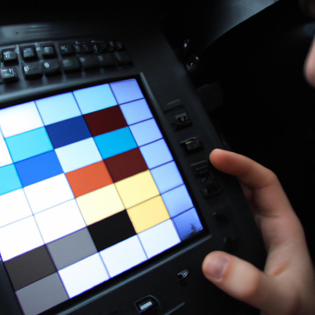
Understanding Map Color Schemes
Maps are powerful tools for visualizing and communicating spatial information. They provide a means to convey complex data in a simplified and accessible manner, allowing users to gain insights and make informed decisions. One crucial aspect of map design is the selection of appropriate color schemes, which can greatly impact the readability and interpretability of the map.
To illustrate the importance of map color schemes, consider a hypothetical scenario where a city planner needs to create a map displaying different land use categories within their jurisdiction. Without careful consideration of color choices, the resulting map may be confusing or misleading. For instance, if residential areas are represented by red and commercial areas by green, viewers might mistakenly assume that these colors represent danger or environmental friendliness respectively. This example highlights how incorrect color associations can lead to misinterpretation and potentially flawed decision-making.
When designing maps, it is essential to select color schemes that effectively communicate information while avoiding ambiguity or confusion. To achieve this goal, several factors should be considered:
-
Color contrast: A high level of contrast between different elements on the map enhances readability and ensures that important features stand out. Use colors with contrasting values (e.g., light vs. dark) or hues (e.g., blue vs. orange) to differentiate between distinct features.
-
Color harmony: Choosing colors that harmonize well together creates an aesthetically pleasing map and improves user experience. Consider using complementary colors (those opposite each other on the color wheel), analogous colors (adjacent on the wheel), or monochromatic schemes (variations of a single hue) to create visually balanced maps.
-
Symbolic meaning: Colors often evoke emotional responses and carry cultural connotations. Understanding these associations can help ensure that your chosen colors align with the intended message of your map. For example, warm tones like reds and yellows generally signify energy or heat, while cool blues suggest calmness or water.
-
Accessibility: It is crucial to design maps that are accessible to individuals with color vision deficiencies. Consider using color palettes that provide sufficient contrast for those with different types of color blindness, and supplement the use of colors with alternative methods such as patterns or labels.
To summarize, selecting appropriate map color schemes is essential for effective communication and interpretation of spatial data. By considering factors such as contrast, harmony, symbolic meaning, and accessibility, map designers can create visually engaging and informative maps that resonate with their audience.
Exploring Map Style Customization Tools
Understanding the importance of map color schemes provides a solid foundation for creating customized maps. With this knowledge in mind, let us now explore the various tools available for map style customization.
To illustrate the significance of map style customization, consider a scenario where an urban planner needs to create a map displaying different types of land use within a city. By customizing the map colors, they can highlight residential areas in warm tones such as shades of orange or yellow, while using cooler hues like green or blue to represent parks and open spaces. This deliberate choice of colors not only aids in visual clarity but also conveys information effectively to the audience.
When it comes to map style customization, there are several tools that offer users extensive control over color selection and design elements. These tools allow users to modify existing color schemes or even create entirely new ones from scratch. Some popular features include:
- Color palettes: Users have access to a wide range of predefined color palettes with harmonious combinations suitable for different purposes.
- Gradient options: Tools provide options to apply gradients between colors, enabling smooth transitions and enhancing aesthetic appeal.
- Transparency adjustments: Users can adjust opacity levels for individual layers or elements on their maps, allowing them to emphasize certain features while maintaining overall visibility.
- Symbolization choices: Tools often offer diverse symbol sets, including icons and markers, which further enhance data representation and visualization.
In summary, understanding how map color schemes work lays the groundwork for effective customization. Through specialized tools that enable modification and creation of personalized styles, users gain full control over every aspect of their maps’ appearance. In the upcoming section about “Selecting Base Map Colors,” we will delve deeper into techniques specifically related to choosing initial color schemes that form the basis for subsequent modifications.
Selecting Base Map Colors
Exploring Map Style Customization Tools has provided us with the knowledge to adjust various aspects of our maps. Now, let’s delve deeper into the process by understanding how to select base map colors that suit our preferences and needs.
To illustrate this, consider a case study where a travel agency wants to create a series of custom maps for their website. They aim to enhance user experience by incorporating vibrant colors that align with their brand identity while maintaining legibility and clarity. By selecting appropriate base map colors, they can effectively communicate information about destinations, attractions, and transportation options.
When it comes to selecting base map colors, there are several factors to consider:
- Theme: Determine an overarching theme or mood you want your map to convey. For example, if you’re creating a map showcasing natural landscapes, earthy tones like greens and browns may be suitable. Conversely, if you’re designing a city guide, brighter and contrasting colors could help highlight different districts or landmarks.
- Branding: Align the color scheme with your organization’s branding guidelines. This ensures consistency across all marketing materials and helps reinforce brand recognition.
- Accessibility: Consider accessibility requirements when choosing colors for textual elements on the map such as labels and legends. Ensure sufficient contrast between text and background colors to accommodate users with visual impairments.
- User Experience: Keep in mind the intended audience and their expectations from using your customized maps. A well-chosen color palette can evoke emotions, facilitate navigation, and enhance engagement.
Let’s further explore these considerations through the following table:
| Factor | Consideration |
|---|---|
| Theme | Choose colors that align with the desired theme or mood of your map |
| Branding | Maintain consistency by adhering to your organization’s branding guidelines |
| Accessibility | Ensure sufficient contrast between text and background colors for readability |
| User Experience | Use colors strategically to evoke emotions, facilitate navigation, and engage users |
By thoughtfully considering these factors and utilizing the map style customization tools available to us, we can select base map colors that effectively convey information while eliciting an emotional response from our audience. In the subsequent section on “Customizing Land and Water Colors,” we will explore further techniques to enhance our customized maps.
Customizing Land and Water Colors
In the previous section, we explored the process of selecting base map colors. Now, let’s dive into the next step of map style customization: customizing land and water colors. By adjusting these colors, you can create maps that are not only visually appealing but also serve specific purposes or convey particular messages.
To better understand the significance of customizing land and water colors, consider a hypothetical example where you are designing a map for an environmental organization. The goal is to highlight areas with high ecological diversity. In this case, using vibrant green shades for dense forests and rich blue tones for pristine bodies of water would help emphasize the importance of these regions in terms of biodiversity conservation.
When customizing land and water colors on your map, keep in mind the following aspects:
- Contrast: Ensure there is sufficient contrast between land and water colors to make them easily distinguishable at various zoom levels.
- Symbolism: Choose colors that align with the message or purpose of your map. For instance, warm earthy tones may be suitable for representing arid landscapes while cool blues could signify coastal regions.
- Consistency: Maintain consistency throughout your map by applying similar color schemes to different layers such as vegetation, urban areas, and bodies of water.
- Accessibility: Consider accessibility guidelines when selecting colors to ensure people with visual impairments can still interpret your map effectively.
Visual elements like bullet point lists can evoke emotional responses from readers by providing concise information in an organized manner. Here is an example:
- Vivid greens symbolize lush vegetation
- Soft blues represent calm waters
- Earthy browns depict arid landscapes
- Vibrant yellows indicate deserts or sandy areas
Furthermore, incorporating tables allows for easy comparison and analysis of data points. Below is an illustrative table depicting how different color combinations can evoke distinct emotions:
| Color Combination | Emotion Evoked |
|---|---|
| Shades of blue | Serenity |
| Bright greens | Freshness |
| Warm oranges | Energy |
| Muted grays | Subtlety |
By manipulating these elements, you can create visually striking maps that effectively communicate your intended message or information without overwhelming the viewer.
Adjusting Color Intensity and Contrast
Continuing from the previous section where we discussed customizing land and water colors, let us now delve into another important aspect of map style customization: adjusting color intensity and contrast. By fine-tuning these elements, you can create maps that effectively communicate your message while capturing the attention of your audience.
To illustrate this concept, imagine a scenario where you are creating a map to highlight population density in different regions. In order to emphasize certain areas with higher population concentrations, you may want to increase the intensity of the color used for those regions. This will immediately draw the viewer’s eye towards them, allowing for easy identification and analysis. Conversely, if you wish to downplay less densely populated regions, reducing their color intensity can visually convey their lower significance.
In addition to adjusting color intensity, manipulating contrast is also crucial in map design. Contrasting colors enable better distinction between different features on a map, making it easier for viewers to interpret information accurately. For example, consider using contrasting colors when mapping rivers against surrounding terrain or highlighting boundaries between neighboring countries. This ensures clarity and enables users to quickly identify key geographical elements.
When working with color intensity and contrast in map customization, keep in mind the following considerations:
- Use subtle variations in color intensity to provide visual hierarchy.
- Ensure sufficient contrast between adjacent colors for clear differentiation.
- Experiment with various combinations of color intensities and contrasts before finalizing your map style.
- Regularly test your customized maps with representative user groups to gauge their effectiveness in conveying information clearly.
| Considerations for Adjusting Color Intensity and Contrast |
|---|
| – Enhance visual hierarchy through subtle variations |
| in color intensity |
| – Maintain adequate contrast between adjacent colors |
| – Iterate through multiple combinations of |
| intensities and contrasts |
| – Test customized maps with representative user |
| groups |
By understanding how to adjust color intensity and contrast, you can create visually engaging maps that effectively communicate your intended message.
Creating Harmonious Color Palettes
In the previous section, we discussed how to adjust color intensity and contrast in map customization. Now, let’s delve into the process of creating harmonious color palettes for your customized maps. To illustrate this concept, imagine you are designing a map for a travel app that showcases popular tourist destinations around the world. You want to use colors that not only represent each location effectively but also create visual harmony throughout the entire map.
To begin, consider these key factors when creating harmonious color palettes:
-
Hue Selection: Choosing an appropriate range of hues is crucial in ensuring visual coherence on your map. For instance, if you assign vibrant and saturated colors to some areas while using pastel shades for others, it may result in an unbalanced representation. By selecting hues within a similar tonal range or using analogous colors (colors adjacent on the color wheel), you can achieve a more cohesive look.
-
Contrast Balance: Achieving a proper balance between contrasting colors is essential for readability purposes. While high contrast can enhance visibility, excessively contrasting elements might overwhelm users’ perception and make certain features stand out too much. Striking a balance by incorporating moderate contrasts ensures that important details are easily distinguishable without causing unnecessary strain on viewers’ eyes.
-
Consistency Across Layers: When working with multiple layers or thematic elements on your map, maintaining consistency across them helps establish unity and logical connections among different parts of the design. This involves considering attributes such as line thicknesses, label fonts, symbol sizes, and even spatial arrangements so that they align coherently regardless of the layer being viewed.
Now let’s explore an emotional response-evoking bullet point list showcasing the potential impact of well-designed color palettes:
- A thoughtfully crafted color palette captures attention and creates positive associations with your map.
- Harmonious colors evoke feelings of tranquility and clarity among users.
- Strategic use of color can enhance the user experience, guiding users intuitively through your map.
- Carefully selected colors contribute to a professional and polished aesthetic, instilling confidence in users’ perception of your customized maps.
To further emphasize the significance of harmonious color palettes, let’s consider an example table showcasing different approaches to coloring popular tourist destinations:
| Destination | Traditional Palette | Vibrant Palette | Harmonious Palette |
|---|---|---|---|
| Paris | Earthy tones | Bold primary hues | Soft pastel shades |
| Tokyo | Cool blues | Neon brights | Muted neutrals |
| Rio de Janeiro | Warm oranges | Tropical pinks | Rich earthy tones |
| Sydney | Coastal greens | Sunny yellows | Subtle blues |
By comparing these options side by side, one can see how selecting harmonious color palettes enhances the overall visual appeal while still allowing each destination to have its unique representation.
In summary, creating harmonious color palettes for customized maps involves careful consideration of hue selection, contrast balance, and consistency across layers. By achieving visual coherence and evoking positive emotional responses among users, well-designed color schemes contribute significantly to the success of your map customization efforts.
Comments are closed.