Legend Customization: Creating Customized Maps
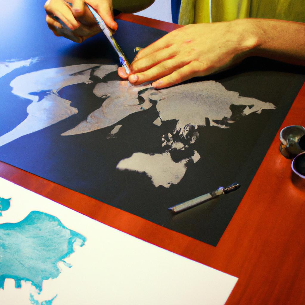
Maps have been used for centuries as a means of visualizing spatial information and aiding in navigation. However, traditional maps often lack the ability to convey specific contextual details that are relevant to individual users or organizations. This is where legend customization comes into play. Legend customization refers to the process of creating customized maps that incorporate tailored legends, allowing users to display and interpret map data according to their unique needs.
To illustrate this concept, let us consider the case of a transportation company operating in a bustling metropolis. Traditional city maps may provide general information about streets, landmarks, and points of interest; however, they fail to capture the intricate nuances of traffic patterns and congestion hotspots during peak hours. By utilizing legend customization techniques, this transportation company can create customized maps that emphasize real-time traffic updates and highlight alternative routes based on current conditions. The resulting map not only aids drivers in optimizing their routes but also assists dispatchers in making informed decisions regarding resource allocation and scheduling.
In academic circles, legend customization has garnered significant attention due to its potential applications across various disciplines such as urban planning, environmental management, and social sciences. Scholars recognize that standard maps can be limiting when it comes to representing complex datasets or addressing specific research questions , and legend customization offers a solution to this challenge. By tailoring the legends of maps to specific research objectives, researchers can effectively communicate their findings and insights in a visually appealing and easy-to-understand manner.
For example, in urban planning, customized maps with specialized legends can be used to analyze population density, land use patterns, or transportation infrastructure. By adjusting the legend to highlight these specific aspects of the city’s landscape, planners can gain valuable insights into areas that require improvement or further development.
In environmental management, customized maps can help visualize data related to pollution levels, biodiversity hotspots, or natural resource distribution. By customizing the legend to represent these environmental factors accurately, scientists and policymakers can make informed decisions about conservation efforts or pollution mitigation strategies.
In social sciences, customized maps with tailored legends can assist in analyzing demographic information or socioeconomic disparities. Researchers can create maps that highlight income levels, education rates, or health outcomes by adjusting the legend accordingly. Such visualizations enable scholars to identify spatial patterns and draw conclusions about social phenomena that may not be evident from traditional maps.
Overall, legend customization offers immense potential for creating customized maps that cater to individual needs and research requirements. Whether it is optimizing routes for a transportation company or analyzing complex datasets for academic purposes, customizing legends allows users to unlock the full potential of map data and enhance decision-making processes.
Choosing colors for map legends
When creating custom maps, one crucial aspect to consider is the selection of colors for map legends. The choice of colors can greatly impact how users interpret and understand the information presented on a map. In this section, we will explore different factors to consider when choosing colors for map legends.
Example:
To illustrate the importance of color selection in map legends, let’s consider a hypothetical case study involving a population density map. Imagine that you are designing a custom map to display population densities across various regions. By carefully selecting appropriate colors for the legend, you can effectively convey the varying levels of population density and enable users to easily comprehend the information being presented.
Factors to Consider:
-
Contrast and readability: It is essential to choose colors that offer sufficient contrast and ensure legibility. Opting for contrasting hues allows users to distinguish between different categories or gradients within the data more effortlessly.
-
Color symbolism and cultural context: Colors often carry symbolic meanings and evoke emotions depending on cultural backgrounds. Considering these factors is important as it can influence how users perceive and interpret the displayed information on the map.
-
Accessibility considerations: Creating inclusive maps involves considering accessibility needs. Selecting colors with appropriate luminosity ensures visibility for individuals with visual impairments or color blindness.
-
Consistency across platforms: If your customized maps are intended for use across multiple platforms or devices, it is crucial to select colors that remain consistent and maintain their effectiveness regardless of screen size or resolution.
Table example:
| Factor | Consideration |
|---|---|
| Contrast and readability | Choose colors with high contrast to enhance legibility |
| Color symbolism | Be mindful of cultural connotations associated with different color choices |
| Accessibility considerations | Ensure visibility by selecting colors suitable for individuals with visual impairments |
| Consistency across platforms | Select colors that remain effective across diverse devices and screen resolutions |
Considering these factors when choosing colors for map legends lays a solid foundation for effective data visualization. Once the appropriate color scheme is established, the next step is arranging items in the legend, ensuring that it complements and enhances the overall map design.
Arranging items in the legend
In the previous section, we discussed choosing colors for map legends. Now, let us explore another aspect of legend customization – customizing the font and style of legend items. By carefully selecting fonts, adjusting sizes, and applying different styles, you can create a visually appealing legend that complements your customized maps.
To illustrate this point, consider a hypothetical scenario where you are creating a map to display population density across different regions in a country. In your legend, you want to emphasize areas with high population densities using bold text and larger font sizes. On the other hand, you aim to use lighter shades and smaller fonts for areas with lower population densities. This strategic use of typography can help viewers quickly identify patterns on the map without being overwhelmed by excessive information.
When customizing the font and style of your legend items, here are some key considerations:
- Typeface selection: Choose a typeface that is easy to read and suits the overall aesthetic of your map.
- Font size variation: Varying font sizes within your legend can highlight important information or differentiate between categories.
- Text formatting: Utilize options like bold, italics, or underline to draw attention to specific elements in your legend.
- Color coordination: Ensure that both the font color and background color contrast well so that all text remains legible.
By paying careful attention to these aspects while customizing your legend’s font and style, you can enhance the visual appeal of your maps and effectively communicate complex data sets to your audience.
Next up is an exploration into adjusting the size of symbols in the legend—a vital step in ensuring clarity and coherence throughout your customized maps!
Adjusting the size of symbols in the legend
Arranging items in the legend allows users to effectively interpret and understand the information displayed on a map. In this section, we will explore various techniques for customizing the arrangement of items within the legend to enhance clarity and visual appeal.
To illustrate one such technique, let’s consider a hypothetical scenario where we have created a map displaying different types of vegetation across a national park. The legend currently presents these vegetation types in alphabetical order, which may not be optimal for conveying important patterns or highlighting specific features. By rearranging the legend items based on their importance or frequency of occurrence, we can provide clearer insights to our audience.
Here are some key strategies for arranging items in the legend:
- Grouping similar elements together: When dealing with multiple categories or classes, it is often beneficial to group related items near each other in the legend. This helps viewers identify similarities and differences more easily.
- Ordering by intensity or magnitude: If your data includes varying levels of intensity or magnitude (e.g., population density), consider placing legends with higher values towards the top, ensuring that viewers’ attention is drawn to areas of greater significance.
- Sequencing chronologically or spatially: For maps representing temporal changes or spatial relationships, organizing the legend in chronological or spatial order aids comprehension by providing a logical flow of information.
- Utilizing color gradients: In cases where colors represent continuous variables like temperature or elevation, arrange corresponding shades in an ordered gradient from light to dark to create a visually intuitive pattern.
Now let’s delve into adjusting symbol sizes within the legend for better visual impact and differentiation.
| Symbol | Size | Importance |
|---|---|---|
| Circle | Small | Low |
| Square | Medium | Moderate |
| Diamond | Large | High |
By carefully considering how you arrange your legend items, you can significantly improve its effectiveness in conveying information to your audience.
[Transition]: Understanding how to customize tooltips will further enhance user interaction and comprehension of the map elements.
Customizing tooltips for map elements
In order to enhance the visual appeal and clarity of a customized map, it is important to consider adjusting the size of symbols in the legend. By carefully modifying symbol sizes, users can effectively communicate varying levels of significance or importance associated with different map elements. For instance, let us imagine a hypothetical scenario where an interactive map displays different types of landmarks in a city: parks, museums, restaurants, and shopping centers. To make this information more easily understandable for users, you could adjust the size of each symbol in the legend based on its relevance within these categories.
To achieve optimal results when adjusting symbol sizes in the legend, there are several key considerations worth keeping in mind:
- Consistency: Ensuring consistency across all symbols helps maintain coherence throughout the map. By using uniform scaling factors for similar features (e.g., parks), users can quickly grasp their relative proportions.
- Differentiation: While maintaining consistency is crucial, differentiation between various symbol sizes is equally important. When multiple categories exist (such as museums versus restaurants), distinct size variations allow viewers to differentiate between them effortlessly.
- Hierarchy: Strategically arranging symbols by size can convey hierarchical relationships among map elements. For example, larger symbols may represent major attractions while smaller ones denote lesser-known places.
A well-designed legend that incorporates adjusted symbol sizes can significantly improve user experience by providing intuitive visual cues about different map elements’ characteristics. It aids users in quickly interpreting complex geographical data and making informed decisions about points of interest.
| Symbol | Category | Size |
|---|---|---|
| 🌳 | Parks | Small |
| 🏛️ | Museums | Medium |
| 🍽️ | Restaurants | Large |
| 🛍️ | Shopping Centers | Extra-Large |
With careful attention to detail and thoughtful adjustments made to symbol sizes in the legend, map creators can effectively communicate information about different elements while improving overall user experience. In the subsequent section, we will explore various color options for legends and their impact on visual perception.
Customizing Tooltips for Map Elements
[Transition Sentence]
The tooltip feature plays a vital role in providing users with additional information about specific map elements simply by hovering over them. By Customizing tooltips, creators can enhance the interactive nature of a customized map and provide context-specific details that are relevant to users’ needs.
Exploring various color options for legends
Customizing the appearance of legends is an essential step in enhancing the visual appeal and user experience of customized maps. By exploring various color options for legends, map creators can effectively communicate information to their audience while maintaining a cohesive design aesthetic.
For instance, imagine you are creating a custom map that displays different types of restaurants in a city. You may want to customize the legend to represent each restaurant type with distinct colors, such as red for Italian restaurants, green for Mexican restaurants, and blue for Asian cuisine. This approach allows users to quickly identify and differentiate between different categories on the map.
To further enhance the impact of your customized legend, consider incorporating emotional triggers through bullet points or tables:
- Highlighting popular dishes associated with each restaurant category.
- Showcasing customer reviews or ratings for featured establishments.
- Including brief descriptions about the ambiance or unique features of specific restaurants.
- Mentioning any special offers or promotions available at certain locations.
A table can be used to present this additional information concisely:
| Restaurant Type | Popular Dish | Customer Rating | Special Offers |
|---|---|---|---|
| Italian | Spaghetti Carbonara | 4.7/5 | Free dessert |
| Mexican | Tacos al Pastor | 4.6/5 | Happy hour discounts |
| Asian | Sushi Rolls | 4.8/5 | Lunch specials |
By utilizing these techniques, you not only provide useful data but also evoke emotions related to dining experiences – making it more engaging for your target audience.
In summary, by exploring various color options and adding relevant details through bullet points or tables within legends, map creators can create visually appealing and informative representations. The customization possibilities are vast; hence it’s crucial to strike a balance between aesthetics and conveying necessary information accurately.
Organizing the order of legend items
Exploring various color options for legends allows users to customize maps according to their preferences and needs. However, another important aspect of legend customization is organizing the order of legend items. This section will delve into the significance of arranging legend items in a logical and intuitive manner.
For example, consider a map displaying different types of vegetation in a national park. The legend could include categories such as “Deciduous Forest,” “Coniferous Forest,” “Grassland,” and “Wetland.” To organize these items effectively, it would make sense to arrange them based on an increasing or decreasing gradient, from left to right or top to bottom. This way, viewers can easily understand the progression from one type of vegetation to another.
To further enhance clarity and comprehension, several guidelines can be followed when Ordering legend items:
- Consider grouping similar or related items together: Placing similar objects side by side helps viewers identify patterns or similarities between them.
- Arrange items based on importance or prominence: If certain elements are more significant than others, they should be placed at the beginning or end of the legend for emphasis.
- Follow a natural flow: In some cases, there may be a natural progression or sequence in which the legend items should appear. For instance, if depicting elevation levels on a contour map, it makes sense to start with lower elevations and progress towards higher ones.
- Keep consistency across maps: If multiple maps within a project share common features or themes, maintaining consistent ordering of legend items ensures continuity and ease of interpretation.
By following these principles when organizing legend items, users can create customized maps that are visually appealing and easy to comprehend. The next section will discuss resizing symbols in the legend for clarity—a crucial step in optimizing map legibility and information delivery.
Resizing symbols in the legend for clarity
Organizing the order of legend items was an essential step in customizing our map to effectively convey information. Now, let’s move on to another crucial aspect of Legend Customization: resizing symbols for clarity. Ensuring that symbols are easily distinguishable and visually appealing is vital in creating a compelling map.
Imagine you are designing a tourist map for a city, highlighting various landmarks such as museums, parks, and historical sites. To make the map more user-friendly, it would be helpful to resize the symbols based on their importance or significance. For instance, larger icons could represent major attractions like famous monuments or popular destinations, while smaller symbols can denote lesser-known places of interest. This visual hierarchy can guide users’ attention and assist them in identifying key locations quickly.
To achieve this level of clarity, consider following these best practices:
- Use different symbol sizes to indicate the relative importance or prominence of features.
- Ensure there is enough contrast between neighboring symbols to avoid confusion.
- Keep in mind any limitations related to map size or scale when determining appropriate symbol sizes.
- Test your resized symbols with representative users to gather feedback and ensure they meet their needs efficiently.
By thoughtfully resizing symbols within the legend, we enhance both functionality and aesthetics. Users will appreciate being able to navigate through the map effortlessly and locate points of interest promptly.
Creating Customized Maps
In the subsequent section about personalizing tooltips for map features, we will explore how adding informative tooltips can further enrich the user experience by providing additional context and details about specific elements on the map.
Personalizing tooltips for map features
Legend Customization: Creating Customized Maps
Resizing symbols in the legend for clarity has allowed us to enhance the visual representation of map features. Now, let’s explore another aspect of legend customization by personalizing tooltips for map features. This feature provides additional information when users hover or click on specific elements of a map.
Imagine you are designing a customized map for a hiking application that showcases various trails across different terrains. By personalizing tooltips, you can provide valuable details about each trail, such as difficulty level, distance, and scenic highlights. For example, when users hover over a particular trail symbol on the map, they can instantly access essential information like elevation gain and estimated time required to complete the hike.
To evoke an emotional response from your audience, consider incorporating these key points:
- Improved user experience: Personalized tooltips offer users an intuitive way to gather more information without cluttering the main display. It enhances their overall experience by providing relevant data at their fingertips.
- Better decision-making: With detailed tooltips highlighting important aspects of each feature on the map, users can make informed choices based on their preferences and capabilities.
- Increased engagement: The interactive nature of personalized tooltips encourages users to explore further and discover hidden gems within the mapped area.
- Enhanced accessibility: Customizable tooltips enable developers to cater to diverse user needs by providing alternative formats or additional language support.
Additionally, we can present this information using a three-column table format with four rows:
| Trail Name | Difficulty Level | Distance (miles) |
|---|---|---|
| Rocky Ridge | Moderate | 5 |
| Pine Forest | Easy | 3 |
| Mountain Pass | Difficult | 8 |
| River Valley | Moderate | 6 |
By integrating personalized tooltips into your custom maps, you create an engaging environment where users have easy access to vital information about different map features. This feature improves the overall usability, leading to better decision-making and increased engagement among users.
Selecting suitable colors for map legends
Personalizing tooltips for map features allows users to provide additional information or context about specific map elements. However, an equally important aspect of creating customized maps is selecting suitable colors for the legends. The legend serves as a key that helps viewers interpret and understand the various elements on the map. In this section, we will explore different strategies for choosing appropriate colors for map legends.
To illustrate the significance of color selection in map legends, let’s consider a hypothetical scenario where you are designing a tourist map for a city with diverse attractions: historical landmarks, parks, museums, and shopping districts. Each category represents a unique type of feature on your map. For example, historical landmarks could be represented by icons resembling ancient architecture while parks might be denoted by tree symbols.
When deciding on colors for each legend item, it is essential to consider factors such as visual hierarchy and accessibility. Here are some best practices to keep in mind:
- Ensure sufficient contrast between background and foreground colors to aid readability.
- Avoid using similar hues that may cause confusion among viewers.
- Utilize complementary or analogous color schemes to create harmony within the legend.
- Consider cultural associations with certain colors; what may convey one meaning in one culture could have a different connotation elsewhere.
Using these guidelines can help make your map more visually pleasing and user-friendly. To demonstrate this further, consider the following table showcasing examples of contrasting colors used effectively in different types of legends:
| Legend Item | Color |
|---|---|
| Historical Landmarks | Dark Brown |
| Parks | Light Green |
| Museums | Royal Blue |
| Shopping Districts | Vibrant Orange |
By carefully selecting distinct colors that represent each category well, you enhance both clarity and aesthetics on your customized maps.
In our subsequent section on customizing the appearance of legend tooltips, we will delve into ways to ensure that tooltip designs complement the overall look and feel of your personalized maps. Let us now explore this topic further.
Customizing the appearance of legend tooltips
In the previous section, we discussed selecting suitable colors for map legends. Now, we will explore another aspect of legend customization: customizing the appearance of legend tooltips. Legend tooltips provide additional information about specific elements within a map when users hover over them.
To illustrate the importance and potential impact of customized tooltips, let’s consider an example scenario. Imagine a tourism website that offers interactive maps showcasing popular tourist destinations in different countries. When users hover over each destination on the map, a tooltip appears displaying key information such as attractions, accommodations, and local tips. By customizing these tooltips to align with the overall design aesthetic and branding of the website, it enhances user experience by providing visually consistent and seamless interactions.
When it comes to customizing legend tooltips, there are several aspects you can consider:
- Layout: Determine how your tooltip should be structured and organized. Consider whether it should include headings, subheadings, bullet points, or other formatting styles.
- Typography: Choose fonts that are legible and visually appealing. Optimize font size and spacing to ensure readability across devices.
- Color scheme: Align the color palette used in your tooltips with the overall theme of your map or application. Consistent use of colors can reinforce brand identity and create visual harmony.
- Interaction behavior: Decide how your tooltip should behave when users interact with it. For instance, consider whether it should remain visible until clicked or disappear after a certain period.
By investing time in customizing legend tooltips based on these considerations, you can significantly enhance user engagement and satisfaction with your maps.
| Aspect | Example |
|---|---|
| Layout | Headings |
| Bullet Points | |
| Subheadings | |
| Typography | Legible Font |
| Appropriate Size | |
| Color Scheme | Brand Colors |
| Harmonious Palette | |
| Interaction | On-hover display |
| Behavior | Click to dismiss |
In summary, customizing the appearance of legend tooltips is a crucial step in creating engaging and visually appealing maps. By considering aspects such as layout, typography, color scheme, and interaction behavior, you can create tooltips that align with your map’s overall design aesthetic and enhance user experience. Remember to strive for consistency and coherence throughout your map application to provide users with a seamless and enjoyable journey.
Comments are closed.